Navigation : Home : Optipix : Optipix User's Guide : Workflow
Optipix User's Guide: Workflow
Included on the Optipix CD is George DeWolfe's "Digital Fine Print Workflow." This workflow takes the user through the steps from acquiring through printing an image, describing in detail how to get great results from a purely digital system. From taking the picture to the final print, George DeWolfe shares his expertise in a clear, concise manner with plenty of examples. This DFP workflow is free to Optipix users.
We've included an excerpt of the DFP workflow manual here.
When we first look at a digitally printed image - a proof, if you will - our first impression is the most important because we see the whole and in general have a feeling that it works or doesn't. It is important to want the whole to work in harmony, and as the conductor, we have to know the instruments playing the parts that make up the whole. Let's look at the instruments which, harmoniously or not, make up the whole of a digital fine print.
The aesthetic idea of sharpness comes from our desire for things in the work to have optical focus and clarity of detail. The objects in a photograph are either in focus or out; they are resoundingly clear in detail or they aren't. It is important to know what in the picture needs to be sharp and what doesn't.
Sharpness (or softness, if that's what you're after) is a result of many factors. The main antagonists here are: camera focus - Was the image sharp to begin with? - and resolution - Did you shoot or scan it at a high enough resolution?
Brightness is simply how light or dark the print feels to you. This is both a rational and an intuitive exercise. Only the photographer who took the picture can judge whether a print of it is correct in brightness. It can effect the overall sense of light in the image, or any specific local area.
Contrast is a visual measure of the number of gray values between the highlights and shadows of the image. This can act in an overall sense, making the picture feel that it has not enough grays (contrasty) or too many (flat) between highlights and shadows, or it can act on local areas of the image making them appear flat or contrasty, but not necessarily affecting the overall contrast. Contrast and Brightness are often confusing to beginning photographers because they are sometimes difficult to tell from one another.
When you look at the image, notice if there are defects present like dust, scratches, water marks and other mechanical problems. They have a notorious ability to destroy the aesthetic integrity of any fine print.
This is truly an aesthetic problem and decision. Often treated mechanically, it is important because it frames the composition the way the photographer saw the image precisely.
Managing and calibrating color for digital printing involve important and key steps at the very beginning of the workflow: calibrating the monitor, setting correct color settings in Photoshop, making a proper proof setup, and using accurate printer profiles for the final output of the digital print. These actions help the photographer achieve the image originally visualized. Only if proper color management is followed can the aesthetic problems of color in an image be addressed. The subtle judgment of detecting off color in the image and the method used to correct it are then handled safely.
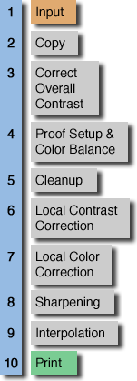
The order in which these six "instruments" of Sharpness, Brightness, Contrast, Color, Cropping, and Defects are handled when diagnosing and printing is not important. What usually happens is that the worst offender is often recognized first, as it tends to be the most glaring of the group. In a normal photograph, however, in which all the instruments are relatively equal, there is a consistent way to deal with them all. It's called a workflow.
Next: Auto Contrast
Prev: 16 bit Images
Up: Optipix